Reductive dechlorination is one of the most useful stories your groundwater data can tell you — if you know how to read it. A monitoring well that's loaded with cis-DCE and VC isn't necessarily a disaster. It might be evidence that natural attenuation is doing the work for you. Here's how to walk the decay chain on your own data and what each step is telling you.
The Chain, Briefly
Under anaerobic conditions, chlorinated ethenes biodegrade via sequential reductive dechlorination. The pathway looks like this:
- PCE (tetrachloroethene) →
- TCE (trichloroethene) →
- cis-1,2-DCE (cis-1,2-dichloroethene) →
- VC (vinyl chloride) →
- Ethene (the non-chlorinated, non-toxic endpoint)
Each step replaces a chlorine atom with hydrogen, mediated by a microbial community that needs the right redox conditions and the right electron donors. The kinetics aren't always tidy — you'll see stalls at cis-DCE, accumulation of VC, or evidence that the dechlorinators ran out of food halfway through. That's exactly why visualizing the chain matters.
What “Good” vs. “Stalled” Looks Like
A successful, ongoing reductive dechlorination signature has a few hallmarks:
- Daughter products are present — not just the parent. If you have PCE and no TCE, no cis-DCE, no VC, no ethene, biology isn't doing much.
- The chain is balanced toward the end — over time, mass shifts from PCE/TCE toward cis-DCE, VC, and eventually ethene.
- Ethene is present — the cleanest evidence the chain is going to completion.
- Geochemical indicators line up — methanogenic or sulfate-reducing conditions, low ORP, depleted electron acceptors.
A stalled chain, on the other hand, often looks like a wall of cis-DCE with no VC or ethene, often paired with sulfate that hasn't been consumed. That's a signature that dechlorinators (specifically Dehalococcoides) either aren't present, aren't active, or are short on hydrogen-yielding substrate.
Why This is Painful in Raw Excel
The standard way to look at this is a stacked time-series plot per monitoring well, with the five analytes on top of each other in molar units (not mass — molar matters because each step removes a chlorine). That means:
- Converting each analyte from µg/L to mol/L using its molecular weight
- Stacking them in the correct decay order, not alphabetical order
- Plotting per well across sampling rounds
- Repeating for 8–15 monitoring wells
That's hours of pivot-table gymnastics, and the conclusions are buried under the mechanical work. Almost no one does it for every site.
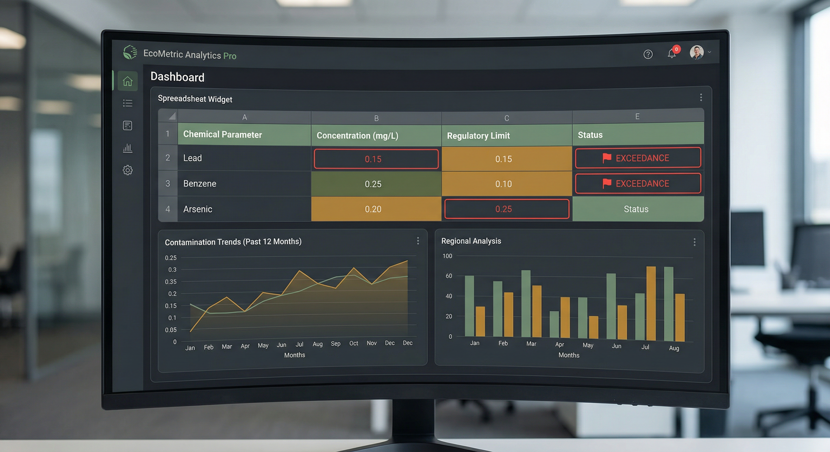 A typical environmental data screen. Useful, but it doesn't let you see the decay chain at a glance.
The Decay Tracker: One Chart, One Story
The Decay Tracker chart in [GRYD] is purpose-built for this read. You point it at the five analytes — PCE, TCE, cis-DCE, VC, Ethene — for a single monitoring well, and it returns a stacked area plot in molar units across the sampling history. Three things appear at a glance:
- Mass shift over time — if the early rounds are PCE-heavy and the later rounds are VC- and ethene-heavy, you're watching reductive dechlorination happen.
- Stalls and bottlenecks — a cis-DCE plateau pops out immediately, telling you whether you need to think about bioaugmentation.
- Multi-well comparison — if upgradient wells stall and downgradient wells go to ethene, you have spatial confirmation that the plume is being attenuated as it migrates.
The chart accepts data directly from your existing analytical sheet. Unit conversion is automatic via the Conversion Analysis Hydrocarbon module, which knows the molecular weights of every chlorinated ethene and handles BTEX-style co-contaminants if present.
How to Read the Output
Three patterns we see often, and what they typically mean:
Pattern 1: Clean “Ramp to Ethene”
Early sampling rounds dominated by PCE / TCE. Mid-rounds dominated by cis-DCE / VC. Late rounds showing ethene. This is a working monitored natural attenuation (MNA) case. The regulator wants to see this story — document it and use it.
Pattern 2: cis-DCE Plateau
Mass concentrates at cis-DCE and stays there for years. VC and ethene are absent or trace. This is the classic Dehalococcoides-limited stall. Treatment options: bioaugmentation with Dehalococcoides cultures, electron donor amendment (lactate, EVO), or accepting a longer remediation timeline.
Pattern 3: VC Accumulation
cis-DCE has stepped down to VC, but VC isn't progressing to ethene. Since VC has the lowest regulatory threshold in the chain, this is often the worst case from a closure perspective — you're now exceeding the most stringent guideline value in the whole sequence. The Exceedance Report in [GRYD] flags this automatically.
Where the Decay Tracker Sits in the Workflow
The chart isn't the end of the story — it's the diagnostic that drives the next decision. Once you've identified a stalled chain in well MW-04, the natural next questions are:
- What's the spatial extent of the stall? — cross-reference with the GIS plume map and other wells.
- Does the stall correlate with a redox boundary? — pull up the geochemical indicator panel.
- What would remediation cost? — the volume calculator gives you m³ of impacted soil per exceedance threshold.
- What does this mean under the active guideline pack? — the exceedance report cites the specific Tier 2A or CCME values for VC.
And if you'd rather just ask: open the Ask GRYD panel and ask, “Is reductive dechlorination going to completion at this site?” The AI co-pilot reads your active screening output and the Decay Tracker visualization, then answers with row-level citations.
See the Decay Tracker on Your Own Data
Bring a chlorinated-ethene dataset to a demo and we'll walk the chain on it together.
Book a Demo